

Correlation, Diversification & Allocation - Everything That Moves the Global Economy & Your Portfolio

Any economic and financial publication should probably start with a generic definition of its topic, but, if you allow, let's skip that today. Everybody knows what the 60/40 portfolio is and why it achieved such an iconic status.
60% equities + 40% bonds = the gold standard of long-term asset allocation.
The 60/40 portfolio is among the first concepts many of us study at university. It constantly reappears in finance literature and remains one of the most frequently discussed portfolios on social media. It is the portfolio everybody knows. Yet it is also the portfolio everybody wants to improve.
For decades, investors, academics and financial commentators have searched for a better mix of stocks and bonds. Some argue for more equities, others advocate more bonds. And yet, after all these years, the conversation keeps returning to the same place: the 60 and the 40.
In this edition of Macro Moves, we look at why. We revisit the relationship between stocks and bonds, explore how the portfolio performed across different market environments and investment horizons, test whether the concept works outside the United States and ask one of today's most popular questions: can bonds be replaced at all?
Before we dive into correlations, efficient frontiers and decades of market history, it is worth asking a simpler question: why did the 60/40 portfolio become so popular in the first place?
One possible answer comes from an unexpected place. The 60/40 portfolio is… like the Toyota Corolla of finance. Nobody puts a poster of it on their wall, nobody brags about owning one, but millions of people rely on it because it is simple, dependable and usually gets the job done.
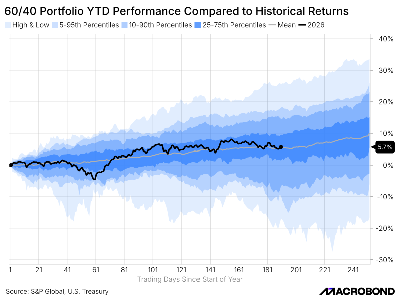
The same logic applies to the 60/40 portfolio itself. Its historical performance has never been particularly spectacular: annual returns have typically fallen in the 5-15% range, with a long-term average of around 10%. That is lower than the long-term return of equities, but in return the 60/40 portfolio offered lower volatility, smaller drawdowns and - perhaps most importantly - fewer sleepless nights.
Yet the key feature of the 60/40 portfolio is not its return, but the relationship between its two components. After all, combining stocks and bonds only makes sense if they provide some diversification, or put simply, if they do not always move in the same direction.
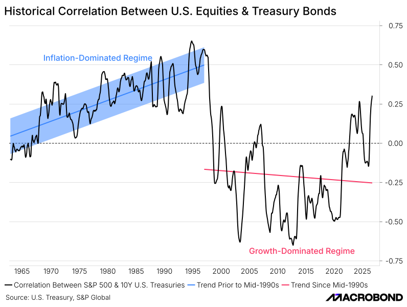
Before the mid-1990s, the relationship between stocks and bonds was quite clear. Correlation was positive and kept moving higher over time. That was the so-called inflation-dominated period: the oil crises of the 1970s, the messy 1980s and the uncertain beginning of the 1990s. Inflation was the main (if not "only") thing markets cared about.
Then the global economy shifted toward a growth-driven regime and the old relationship between stocks and bonds basically disappeared. Since the mid-1990s, trying to draw a meaningful long-term trend has become almost impossible. Correlation spent most of that period below zero and that is probably the single most important conclusion from this chart. Negative correlation means diversification. And diversification means (in a somewhat oversimplified manner), "crash insurance".
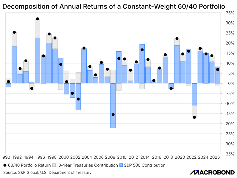
Yet the idea sounds simple enough: when one asset falls, the other helps soften the blow. Over the past 35 years, there were plenty of "cooperative" years when both asset classes pushed the portfolio higher. Then there were the more one-sided years, when one asset declined while the other acted as a shock absorber. Bonds did not save equities during the Global Financial Crisis in 2008, for example, but they did help offset part of the losses.
That is the real strength of the 60/40 portfolio. It is not built on strong returns from either stocks or bonds alone, but on the fact that the two assets rarely disappointed investors at the same time. There will always be good years and bad years, but the idea is that the two components help balance each other out.
This could be a perfect place to end this edition of Macro Moves. We have explained what the 60/40 portfolio is, why it works and how it has performed historically. But no discussion of the 60/40 portfolio seems complete without revisiting the proportions themselves. The famous 60 and the 40.
For as long as the portfolio has existed, somebody has been arguing that the mix is not quite right. That it should really be 70/30, 50/50 or something else entirely. Entire books, conferences and social media debates have been devoted to finding the "optimal" allocation.
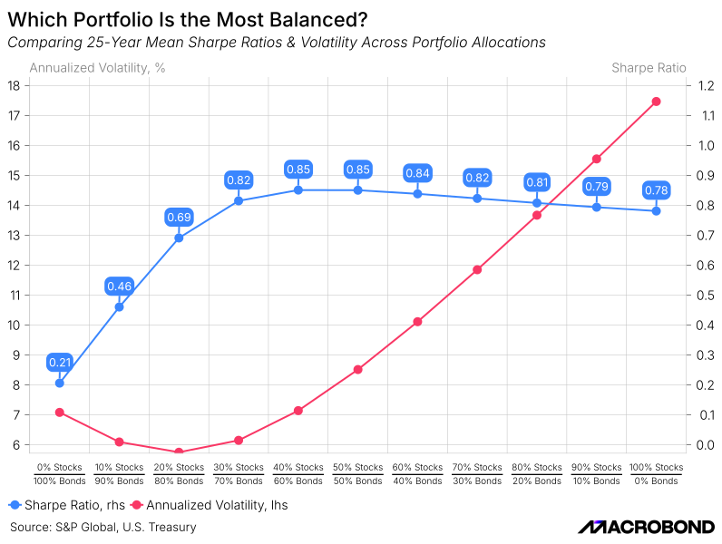
First, let us look at where the idea of 60/40 comes from. If we compare different combinations of stocks and bonds over a reasonably long period, say the past 25 years, two things become immediately clear. The lowest volatility is achieved not by holding bonds alone, but when they are combined with roughly one-third of equities.
Of course, lower risk comes at a price. Portfolios heavily tilted toward bonds tend to deliver lower returns. As the equity allocation increases, returns improve, but so does volatility. Somewhere between these two extremes lies a compromise most investors are willing to accept. Historically, it has tended to favor portfolios with roughly 50-60% equities, which helps explain why the traditional 60/40 allocation became so popular.
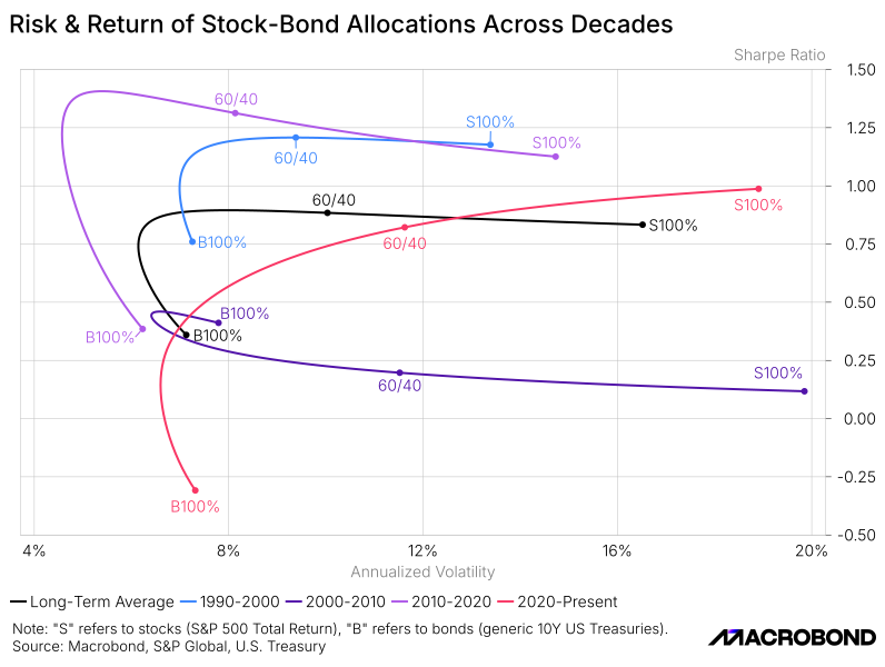
“Historically” may be the most important word in any discussion of the 60/40 portfolio. The strategy is widely viewed as a benchmark for long-term investing, but there is no agreement on what "long term" actually means. Ten years? Twenty?Thirty? Fifty? The answer matters because changing the historical horizon can significantly change the conclusions.
One investor may focus on the past decade and find a very different "optimal" allocation than someone looking at the past thirty years. Neither is necessarily wrong. They simply answer different questions.
The chart below shows the efficient frontier using more than three decades of data. First, focus on the black line in the middle, which represents the long-term average. Notice where the traditional 60/40 portfolio sits. It is not the best-performing allocation, nor is it the least volatile. Instead, it occupies a relatively attractive position between the two.
Not every decade favored 60/40. Some periods rewarded a higher allocation to equities, while others favored a more defensive mix. Yet as a general rule, portfolios with roughly 50-60% equities consistently occupied the part of the frontier where many investors found the balance between risk and return most attractive.
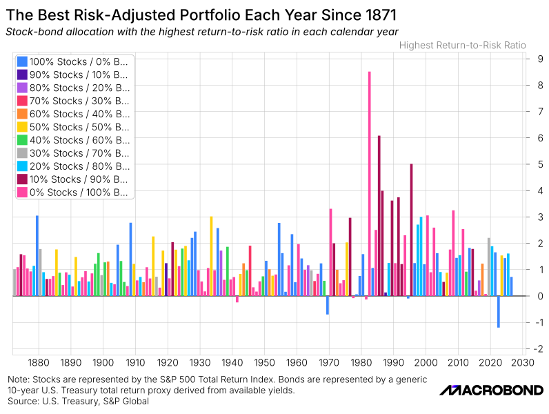
The picture becomes much messier when we zoom in to the annual level. Using a proxy dataset covering roughly 150 years, we looked at which stock-bond allocation delivered the best result in each individual year. When building the chart, we genuinely expected to see at least some recurring trends. Instead, we got a variety of colors and very little evidence of a persistent winner.
Some years rewarded aggressive equity allocations. Others favored more balanced portfolios. Occasionally, even the most conservative mixes came out on top. In a way, this should not be surprising. What works best during an inflationary boom may be completely different from what works best during a recession or a market crash.
The chart may contradict the idea of long-term investing, but it highlights an important point: even if 60/40 appears attractive over longer horizons, there is no guarantee it will be the best-performing allocation in any particular year.
There is one obvious objection to everything discussed so far. Most discussions of the 60/40 portfolio are heavily influenced by the U.S. experience. What if the whole idea is little more than an American success story? What if the same logic does not apply elsewhere?
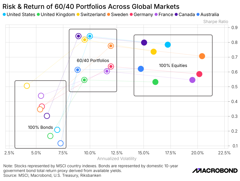
Fortunately, this is relatively easy to test. We repeated the exercise across a range of developed equity and bond markets and compared the traditional 60/40 allocation against portfolios invested entirely in stocks or entirely in bonds.
In nearly every market, a balanced stock-bond portfolio delivered a more attractive combination of return and risk than either of the two extremes. The exact proportions may vary, but the underlying idea of the 60/40 “travels” surprisingly well.
Finally, let us address one of the most popular questions surrounding the 60/40 portfolio today.
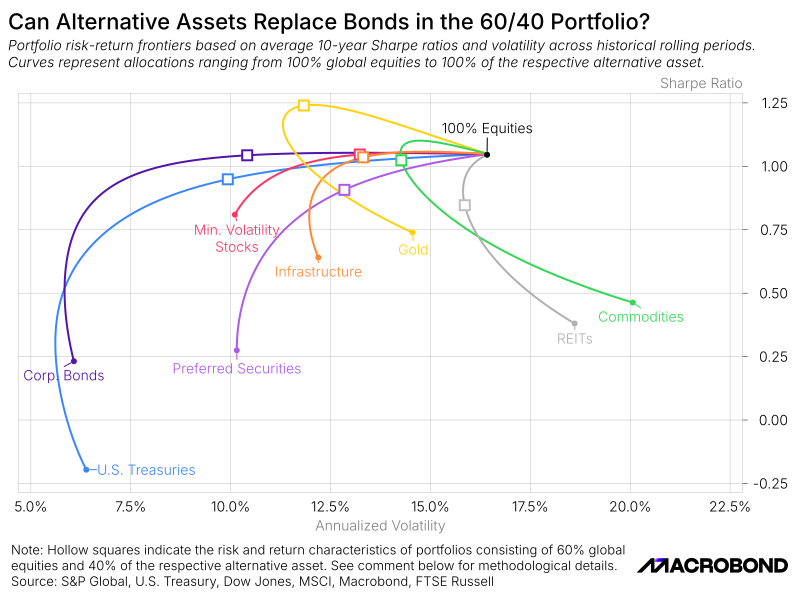
Bonds have had a difficult decade. Rising inflation, aggressive monetary tightening and higher interest rates have led many investors to question whether they still deserve a place in a traditional portfolio. As a result, a growing number of alternatives have been proposed, from gold and commodities to real estate, infrastructure and other diversifying assets.
The chart below tests some of the most common suggestions. Instead of combining stocks with bonds, we replace the bond allocation with alternative assets and compare the resulting portfolios over the past decade. Despite the challenging environment, the traditional stock-bond combination continues to be one of the most attractive positions on the efficient frontier. Some alternatives delivered higher returns, while others reduced volatility, but few managed to improve both at the same time.
In other words, bonds may be unpopular, but replacing them turns out to be much harder than many investors expect.


