Macrobond 1.24
We are pleased to present an updated version of our application.
Highlights
- Ability to create lists of series
- Cross sampling analysis
- Conditional formatting in bar charts (Heat maps)
- Fresh look and feel
- New chart settings and options
Selection of new functionality
Lists of series
The highlight of all the new features of Macrobond 1.24 is the ability to organise large sets of series. Simply click on the new Lists tab, which you can find within Series.

You can use the name of a list in a formula expression and the calculation will be applied on all the series of the list. For example, in the image above, you can use the ‘cpicomp’ list in a formula expression like this: cop(list:doc:cpicomp,1).This is easier to write, gives you a better overview and allows you to add more series to your list.
You can change the order of the series in a list and it will be retained and will not break any calculations.
In most analyses, such as Rate of change, you can set parameters for the whole list.

In most analyses, you can make exceptions at series level:

Lists can also be combined. This works in formulas and in the new Cross sampling analysis.
Combining lists works if the lists have a relationship (parent/child lists) or if they are organised by region using the List by region list type. Here is an example where several List by region lists have been created:

You can then use a formula expression like list:doc:gdp/list:doc:pop. The calculation will be applied pairwise to the series in the lists to generate a new list.
Read more here or by pressing F1 in the Series list analysis.
Cross sampling analysis
Our new Cross sampling analysis is a successor to the Scalar analysis, with a new workflow that is especially tailored for lists.
Simply add the lists to the table on the right. In this example, the lists are of type List by region and automatically align.

In this next example, the output is sorted by population and the ten largest cities are presented in a bubble chart

Read more here or by pressing F1 in Cross sampling analysis.
Conditional formatting in Bar charts (heatmaps)
You can set up conditional formatting in Bar chart in a similar way to Excel. This can be used for visualisations such as heatmaps to show negative values and highlight largest and smallest values and outliers.
In this table (bar chart), you can see that negative values are presented in red text, the two smallest values against a red background, and the two highest values against a green background.

You can set up the rules by pressing the Rules button in the Bar chart settings.


Here is an example that illustrates using rules to create a heatmap:

Read more here or by pressing F1 in the Rules dialog.
Fresh look and feel
We have updated the fonts and colour palette of the application and charting tools so they align with our our refreshed corporate brand. The new look is cleaner and less distracting, with fewer borders and gradients.
Font size as pixels or points
In the Font dialog, you can now choose the unit of the font size as either pixel (as before) or point, which is more standard. You can enter one decimal digit.

A pixel in this context is 1/96” and a point 1/72”.
New chart settings and options
Patterns for filled graphs
For filled graph types (bars, stacked columns, area, stripe etc.) you can now select a pattern for the background. This can be useful to contrast or complement different colours.
This functionality may not achieve the same result when the charts are opened in Microsoft Office due to the software’s format limitations. However, images exported as bitmaps or SVG should be fine.

Graph area borders
The image below shows some of the new options you can choose from when creating borders for your graphs. There are now options for including only left and/or right sides for the graph area border.

Graph area margins
You now have more control over how margins are allocated around graph elements.
Under the default setting, margins above and below the highest and lowest values are wide enough to accommodate line width, marker size and height of y-axis label texts inside the graph area.
Now you can set your margins as Graph margin outside, which allocates enough space outside the graph area to prevent any overlap with surrounding elements.
Take a look at the x-axis on these two charts.
In this example, the margin is set to inside.

In this example, the margin is set to outside.


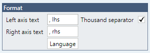
Thousand separator
You now have an optional Thousand separator setting for the axes in the charts, which adds a separator after every third digit for numbers larger than 1,000. You can find this in the language settings selected for the chart.

In addition to the Thousand separator for Observation labels and other places where dynamic text is used, you can choose additional formatting options from the drop-down list.


New calculation method for Smoothing and Statistics
We have added a new None as a way calculation method for Smoothing and Statistics analyses so you can include the original series without any calculations.
